SAP Analytics Cloud Analytic Applications offer a way to create interactive dashboards or even “mini-applications” based on analytical and planning data by putting your logic into script code. It offers some standard control types that you can drag and drop onto your canvas to build the user interface – texts, links, buttons, images, checkboxlists…
But when it comes to the display of more complex data types, your options are quite limited with the standard widgets available.
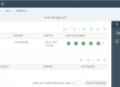
Crosstabs can display tabular data, however this data needs to be available as fact data in your model, and you have no direct control from script. The solution: a table display widget that will display a classic, native UI5 table, not a crosstab. Ideally with the possibility to diplay links, buttons, icons and other types of controls in the table call. Maybe even supporting sorting, grouping and search. Something like this:
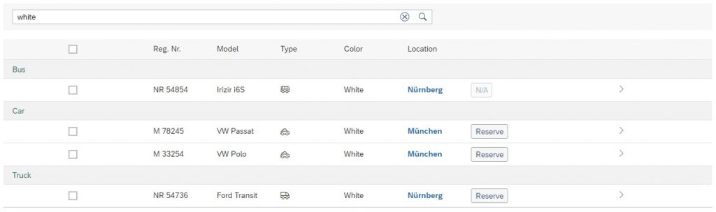
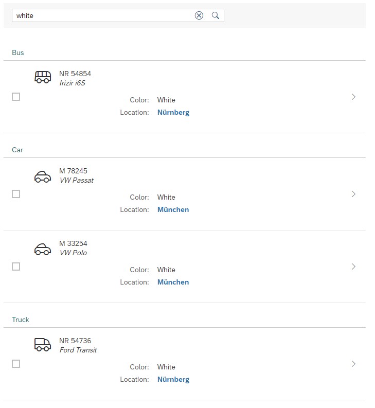
And for mobile applications you probably want this rather as a list than a table, to fit a portrait display of a mobile phone – or into a the left side panel of a “master-detail” screen layout on a monitor:
So how can you achieve that? At the time of writing this blog post the only way to go would be a custom widget.
An SAC custom widget is a set of some javascript files that can be hosted on any web server and imported to your SAC tenant. The widgets can then be used from Analytical Applications just liken any standard controls, and offer a drag and resize interface on the canvas, properties in the designer panel, and methods that can be accessed from script.
But would you really want to develop a custom widget in JavaScript for every table you want to display in your SAC applications? Certainly not! Neither would we. That is why we developed completely generic table and list widgets with dynamically configurable columns, layouts, selection modes, sorting, grouping and search. So adding a table to your SAC application or story is as simple as adding a few lines of script to your app…
Want to know more? Get in touch!