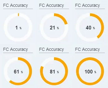
For one of our dashboarding projects we needed to display multiple KPIs, one of them as a tiny “ring chart” showing the forecast accuracy as a percentage between 0% and 100%. Instead of using the built-in chart component of Lumira we used a trick to implement the chart as a light-weight solution with CSS only. The reasons later, let’s first see how it looks:

So why would you fiddle around with creating such a chart with CSS tricks instead of using the stock Lumira chart component? The reason is: performance, performance, performance.
The chart component requires a datasource to acquire the data. And – even though you could use the ‘Data selection’ property to display only a part of the datasource’s data in the chart – it typically requires a separate datasource, which has been created to deliver exactly the data that is to be displayed by the chart. An additional datasource means an additional query, and an additional query means an additional second or two of load time.
Especially in a situation where you need to display several such logically independent key-figures those seconds can quickly add up and result in poor load times (unless you use load groups to have them run in parallel). Our approach was to create a single query including all KPI values in cells of a structure, and create composites for the display of each KPI, with a ‘value’ property of the composite bound to a data selection representing a single cell of the query.
While some KPIs are simply displayed as an absolute value or a plus-minus percentage deviation – not requiring more than a simple TEXT component for display – the forecast accuracy had to be displayed as a ‘gauge’, and is a bit more tricky to implement.
Creating an own Lumira SDK extension for this simple task was not an option (due to maintenance effort), so we decided to go for a solution built using standard Lumira PANEL and TEXT components, and custom CSS to bring these components into a gauge shape.
A gauge is basically a ring chart with a single ‘slice’, while a ring chart can be reduced to a pie chart with a circle covering the middle – so effectively we had to get a ‘single slice pie chart’ implemented with CSS only. If you google ‘CSS pie chart’ you will find several alternative solution, what makes it a bit trickier in Lumira is that you have no control over the HTML, just the CSS.
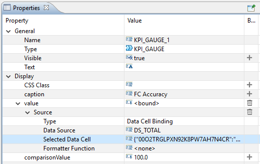
The chart was implemented as a Composite in Lumira Designer, with a ‘value’ and a ‘comparisonValue’ property you can bind against two cells of your datasource. Alternatively you can bind just the ‘value’ property to a percentage cell and leave ‘comparisonValue’ at its default value of 100. Besides this the composite features a ‘caption’ property to display a title.

The composite includes the following components:
- A PANEL component for a background circle, CSS class RBGaugeBgCircle
- A PANEL component to display the pie slice, CSS class RBGauge (plus additional CSS classes set by script depending on the value)
- A TEXT component to display the middle circle (the hole of the donut), CSS class RBGaugeMiddleCircle
- A TEXT component to display the caption, which is probably of less interest
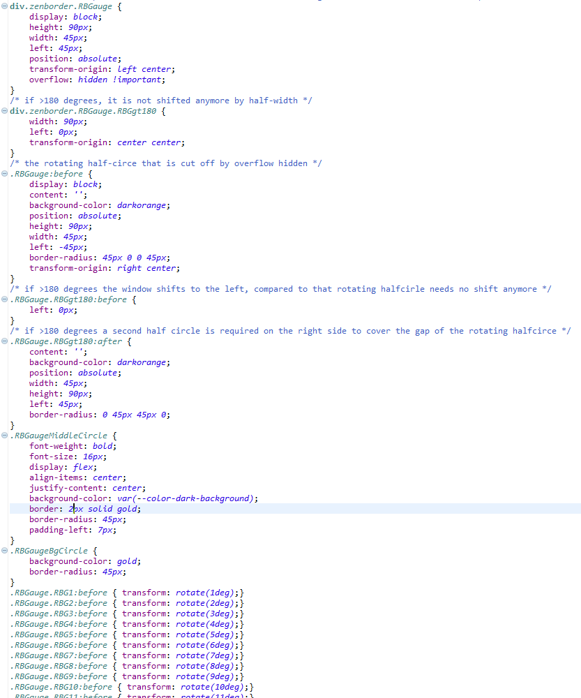
The magic happens in the CSS:

This is how it works:
- A half-circle is rendered with the .RBGauge:before pseudo-element. It is shaped from a box to a half-circle using the border-radius property, and is prepared to be rotated with 0-360 degrees.
- The actual rotation is set using .RBGauge.RBGn:before where n corresponds to the degrees of rotation. (Unfortunately, there is no better solution than having 360 such lines in the CSS due to restrictions in the Lumira API.)
- The element with class RBGauge acts as a ‘window’ which only displays a part of a half-circle that is being rotated. It clips everything to the right half of the quadratic pie area. The property ‘overflow: hidden;’ is what makes the area of the half-circle outside of the ‘window’ to be cut off and hidden. (The prefix div.zenborder in the selector is required to be able to override the overflow property due to CSS selector specificity rules.)
- If the rotation is more than 180 degrees, there is a switch in logic. This is triggered by the additional class .RBGgt180 which will effectively deactivate the ‘window’ (extend it’s size to the whole pie area instead of only the right half), and show the full half-circle, which is (due to the rotation) already fully on the left side. In addition a second half-circle is created by
pseudo-element .RBGauge.RBGgt180:after. This is required as a single half-circle is obviously not enough to cover more than 180 degrees.
(Additional CSS properties might be required to make the solution work on all browsers.)
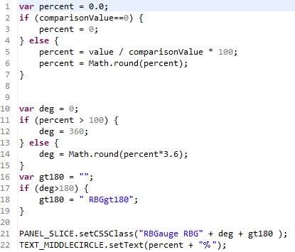
The CSS classes are controlled from Lumira script as follows:

It will set CSS class .RBG… to set the rotation in degrees, and additionally – if the rotation is above 180 degrees – .RBGgt180 as well.
The solution above shows, that with a bit of CSS creativity and a few hours of time spent, it is possible to render custom charts and visualizations in Lumira Designer event without creating or installing a custom SDK extension – just by using the <DIV> elements that are rendered as part of standard Lumira components. Typically the :before and :after pseudo-element are at the heart of such solutions, as they allow additional ‘objects’ to be added to the DOM just from CSS.
Such CSS based charts and visualizations can add a highlight to your design without sacrificing performance, and do not require any plug-in installation neither on client (designer) nor on server side.
